Contact@prince2training.co.uk
 01344203999


 Back
Back
Table of Content

05-May-2026

Veronica Davis
Have you ever started a project sprint feeling confident, only to realise halfway through that tasks are piling up and deadlines are getting closer? In Agile teams, tracking progress clearly is essential to avoid such situations. This is where a Burndown Chart becomes valuable, helping teams visualise how much work remains and whether they are progressing toward completion on time.
By displaying remaining work against time, a Burndown Chart provides a quick view of project progress. It helps teams stay focused on sprint goals, spot delays early, and adjust tasks when needed. In this blog, we’ll explore its types, key components, and how to create one effectively. Let’s begin.
What is a Burndown Chart?
A Burndown Chart is an Agile Project Management tool used to visually track the amount of work remaining over a specific period of time in a project or sprint. This Burndown Chart highlights how teams measure progress and determine whether tasks are being completed according to the planned timeline.
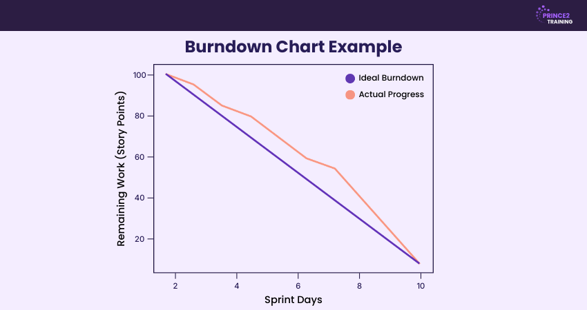
In a Burndown Chart, the Y-axis (vertical axis) represents the amount of work remaining, while the X-axis (horizontal axis) represents time, such as days in a sprint. The chart also includes an ideal progress line that shows how work should decrease to reach zero by the end of the sprint or project.

Types of Burndown Charts
Burndown Charts can be used at different levels of Agile Project Management to track progress over time. Each type focuses on a specific scope of work, helping teams monitor tasks, releases, or long-term goals. The main types of Burndown Charts used in Agile projects are explained below:
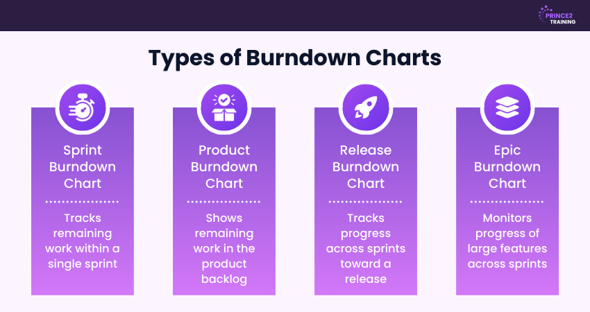
1) Sprint Burndown Chart
A sprint Burndown Chart displays the remaining work during a sprint, which usually lasts between one and four weeks. The chart is updated daily to show how much work has been completed and how much remains. It helps the team monitor daily progress, identify blockers early, and stay aligned with the sprint goal.
2) Product Burndown Chart
A product Burndown Chart provides a high-level overview of the total work remaining in the product backlog. It tracks progress from the start of the project until completion. Product owners and stakeholders use this chart to understand overall development progress and plan future releases more effectively.
3) Release Burndown Chart
A release Burndown Chart tracks progress across multiple sprints that contribute to a planned product release. It shows how much work remains until the release deadline and helps stakeholders determine whether the team is on schedule. This chart is useful for predicting delivery timelines and managing scope changes during development.
4) Epic Burndown Chart
An epic Burndown Chart focuses on larger bodies of work known as epics. Epics are major features or initiatives that are broken down into smaller tasks and completed across several sprints. This chart helps teams track long-term progress and ensure that large features are progressing as planned.
Components of a Burndown Chart
A Burndown Chart includes key elements that help teams track project progress and remaining work. These components make it easier to compare planned progress with actual performance. The main components are explained below:
X and Y Axes
A Burndown Chart contains two axes: X-axis and Y-axis. The horizontal axis (X-axis) represents time, such as days in a sprint or stages of a project timeline. The vertical axis (Y-axis) represents the amount of work remaining, usually measured in story points, tasks, or hours for progress tracking.
Ideal Remaining Work Line
The ideal remaining work line shows the expected rate at which work should be completed during the sprint or project. It is usually drawn as a straight line from the total work at the start to zero at the end. This line acts as a benchmark that helps teams understand whether they are progressing as planned.
Actual Remaining Work Line
The actual remaining work line represents the real progress made by the team. It is updated regularly as tasks are completed and shows the remaining work at each point in time during the sprint. Unlike the ideal line, this line often fluctuates because teams complete work at different speeds throughout the project.
Develop advanced Project Management capabilities through PRINCE2® Practitioner Training.
How to Create a Burndown Chart in Five Steps?
Creating a Burndown Chart is simple and can be done using spreadsheets or Agile Project Management tools. By following a few clear steps, teams can track remaining work and monitor sprint progress. The main steps are outlined below:
Step 1: Define the Total Work
Begin by listing all tasks, user stories, or backlog items that must be completed in the sprint or project. Estimate the effort needed for every task using story points, hours, or another metric. Adding these estimates together gives the total amount of work that forms the starting point of the Burndown Chart.
Step 2: Set up the Chart Axes
Create a line chart with time on the horizontal axis and remaining work on the vertical axis. The X-axis usually represents days or sprints, while the Y-axis represents effort such as story points or hours. The ideal Burndown line starts at the total effort and gradually decreases to zero by the end of the sprint timeline.
Step 3: Define the Ideal Burndown Rate
Determine how much work should be completed during each time period to finish the sprint on schedule. This is calculated by dividing the total work by the number of sprint days. The result shows the ideal rate at which tasks should be completed and helps draw the ideal Burndown line for accurate progress tracking.
Step 4: Track Daily Progress
Update the chart regularly by recording the remaining work at the end of each day throughout the sprint. As tasks are completed, the remaining effort decreases, and the actual progress line moves downward. Tracking this daily helps teams quickly identify delays or blockers that affect productivity.
Step 5: Review Progress and Adjust
Compare the actual progress line with the ideal line throughout the sprint timeline. If the actual line moves above the ideal line, the team may be behind schedule. In such cases, teams can reassess tasks, remove blockers, adjust workload, or improve coordination to stay aligned with the sprint goal.
Develop practical Agile Project Management expertise through PRINCE2 Agile® Practitioner Training – Register now!
How to Read a Burndown Chart?
A Burndown Chart is interpreted by comparing the ideal work line with the actual work line over time. The ideal line represents the planned rate of work completion, while the actual line shows the real progress made by the team.
If the actual line stays close to the ideal line, the team is progressing as expected. If it moves above the ideal line, the team may be behind schedule, while a line below the ideal indicates faster progress than planned.
Advantages of Using Burndown Charts in Agile
Burndown Charts provide a clear visual overview of the work remaining compared with the time left in a sprint. This helps Agile teams monitor progress and stay aligned with sprint goals. Some key advantages of using Burndown Charts are outlined below:
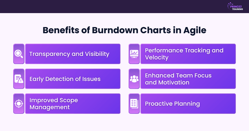
1) Transparency and Visibility:
Burndown Charts provide a clear visual overview of sprint progress. Team members and stakeholders can easily see completed and remaining work, improving project transparency.
2) Early Detection of Issues:
The chart acts as an early warning tool by showing deviations from the planned progress. If the actual progress line rises above the ideal line, it may indicate delays or blockers that need immediate attention.
3) Improved Scope Management:
Burndown Charts help teams identify scope changes during a sprint. When new tasks are added, the remaining work may increase, allowing teams to recognise scope creep and address it promptly.
4) Performance Tracking and Velocity:
By analysing Burndown patterns across multiple sprints, teams can better understand their development pace. This helps them estimate work more accurately and improve planning for future iterations.
5) Enhanced Team Focus and Motivation:
The chart encourages teamwork by showing the daily progress required to meet sprint goals. Seeing the remaining work decrease helps teams stay motivated and focused on completing tasks.
6) Proactive Planning:
Burndown Charts support better planning by showing whether the team is likely to finish the sprint on time. If progress slows, teams can reassign tasks or address blockers early to stay on schedule.
Understand Agile methods while applying PRINCE2 structure with PRINCE2 Agile® Foundation Training – Register now!
Common Burndown Chart Mistakes and How to Prevent Them
Burndown Charts help track sprint progress and improve transparency in Agile teams. However, if not maintained properly, they may provide misleading insights. Common mistakes and how to avoid them are explained below:
Infrequent or Inconsistent Updates
Burndown Charts rely on accurate and up-to-date data. If the chart is not updated regularly, the actual progress line may not reflect the true status of the sprint.
Prevention: Update the chart daily or use automated Project Management tools to ensure progress is tracked consistently.
Choosing an Incorrect Measurement Approach
Using the wrong measurement unit can affect the chart’s accuracy. For example, counting the number of tasks instead of measuring effort may give an unrealistic view when tasks vary in complexity.
Prevention: Use effort-based units such as story points or estimated hours and break large tasks into smaller subtasks.
Ignoring Work in Progress (WIP)
Burndown Charts mainly show completed work and remaining work but do not always highlight tasks that are currently in progress. This can make it harder to detect bottlenecks or predict delays.
Prevention: Combine Burndown Charts with tools such as task boards or workflow tracking systems to monitor ongoing work.
Misreading Fluctuations in Remaining Work
Changes in the remaining work line may occur due to scope adjustments, removed tasks, or revised estimates. Misinterpreting these fluctuations can lead to incorrect conclusions about team performance.
Prevention: Review Burndown data alongside sprint notes or change logs to understand whether progress reflects actual productivity or scope changes.
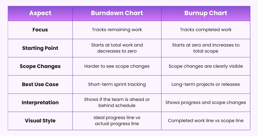
What is the Difference Between Burndown Chart and Burnup Chart?
Burndown Charts and Burnup Charts both track Agile project progress, but they present information differently. A Burndown Chart shows the work remaining, while a Burnup Chart displays the work completed and scope changes. The main differences are shown below:
Conclusion
A Burndown Chart is a valuable Agile tool that helps teams track work remaining and monitor sprint progress clearly. Visualising progress over time improves transparency, supports better planning, and helps identify delays early, enabling teams to stay focused and deliver projects successfully.
Learn structured Project Management and deliver successful projects with PRINCE2® Training – Join now!
Frequently Asked Questions
What is the Purpose of a Burndown Chart?
The purpose of a Burndown Chart is to monitor the amount of work remaining in a project or sprint. It helps teams monitor progress, compare actual work with planned work, and ensure tasks are completed within the expected timeframe.
Is a Burndown Chart Part of Scrum?
A Burndown Chart is not a mandatory artefact in the Scrum framework defined in the Scrum Guide. However, it is widely used by Scrum teams to visualise remaining work overtime. It helps track daily progress, improve transparency, and identify delays early during a sprint.
Is a Burndown Chart a KPI?
No, a Burndown Chart isn’t a KPI. It’s a visual tool showing work completed versus remaining in a sprint, while KPIs are measurable performance metrics like velocity or cycle time. A Burndown Chart helps track progress but doesn’t measure success on its own.

 Continue Browsing